
ROSIE'S EASY CUT-OUTS PI VERSION: 8 (or 7). LEVEL: Beginner MAIN TOOLS USED: Text/Outline or Path Tool, Web Button Designer, Format/Brightness & Contrast, EasyPalette. OPTIONAL DOWNLOADS: If you wish to use the Art Deco font I used in the tutorial, you can find it Here TERMS OF USE: Please Read - Thank You! |
|
INSTRUCTIONS |
|
|
|
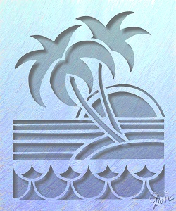
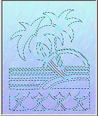
CREATING CUT-OUTS First of all you are going to need to choose what you are going to cut out. This can be a word from a letter font, a fancy dingbat-type font or a Path shape. 1. Open a new canvas, any size you wish your finished picture to be (I used 250W x 300H pixels). 2. You now need to decide on a fill/colour for the canvas. I used a simple gradient fill which I then textured by clicking on Scratch 5 in the EasyPalette Painting Gallery (see opposite). 3. Now click on the Text Tool, set the font and size you need (I am using a capital B from the Art Deco font at size 275) - or alternatively select your path shape - and change the Mode to Selection. 4. Type or draw the lettering or fancy font/path shape that you are going to cut out. If this is not in the middle of your canvas, reselect the Pick Tool & then move the selection using the Arrow keys on your keyboard.
5. Right Click/Invert.
6. Click on Web/Button Designer/Any Shape.
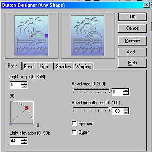
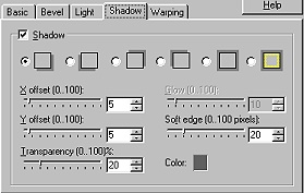
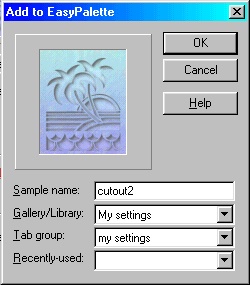
7. Under the Basic tab use the settings shown opposite - Bevel Size - 0: Bevel Smoothness - 100: Light Angle - 0: Light Elevation - 44 (approx): Pressed & Outer - UNchecked. 8. Click on the Shadow tab and use the settings shown opposite - X & Y offset - 5: Transparency & Soft Edge - 20: Color - dark grey (I used Hex#525252 - though you can use any dark colour you wish). Click OK. NOTE: You may need to vary these settings for smaller pictures or those with thin lines where X & Y offsets of 2 and a Soft edge of 5 or less may be more appropriate. 9. If you like the result - you can, if you wish, go back into the Web Button Designer and click on the Add button - this will open up a box (left) where you can type in a name such as 'cutout setting 1' and save it to a Gallery of your choice in the EasyPalette. NOTE! DON'T click OK in the Web Button Designer box again after doing this or you will have applied the effect twice to your picture! You will now be able to apply this cut-out preset to your future cut-outs with a click of the mouse once you have completed Instruction 5 above! (i.e. You are only saving the settings from the Web Button Designer - so you have to follow the tutorial up to that point before applying the preset. It will NOT Invert the Selection for you - which is vital for the cut-out look - nor will it adjust the shading of the foreground and background - see Instructions 10 - 13).
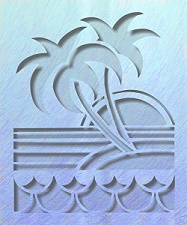
Left you can see the result so far.
10. To make your cut-out stand out even more, hit the Enter button to deselect the cut-out and click on Format/Brightness & Contrast. 11. Click on the bottom, left-hand square, once and OK. 12. Now select the cut out piece again and click on Format/Brightness & Contrast again. 13. This time click on the top, right-hand square, once and OK. |
|
|
ALTERNATIVELY.... A RELIEF...
14. You can leave out Step 5 above and apply the preset you saved in your EasyPalette in Instruction 9 to the selection itself and with one click you have a shadowed relief in the same fill as your background!
A little adjustment with Format/Brightness & Contrast and the result is shown left! |
|
|
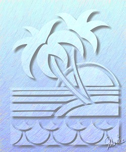
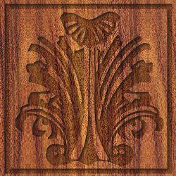
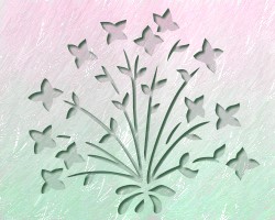
SOME MORE EXAMPLES INCLUDING CARVING..... The first one was done with a font - just by clicking on the saved preset after following the tutorial as far as Instruction 5 - then adjusting Brightness & Contrast as per the tutorial. The second was made by preparing a design in black from an ornamental font and an outline shape. These I merged as a single object. Then I used Edit/Trace/Selection marquee - and OK. I then changed the Mode to 'Selection' and, after moving the original design out of the way with the Pick Tool, followed the tutorial from Instruction 5. I changed the Shadow to 2 and the Color of the Shadow to black for this one. You can always use a larger bevel if you want the carving to 'stand out' more.
The third (bird) one used the tutorial preset only with an added Path Shape branch in the bird's beak.
The fourth one was done as per the tutorial but using Right Click/Modify Properties and Apply on the preset and slightly altering the Shadow only to a smaller number & a different colour. |
 |
|
|
Free Spirit Graphics If you would then like an invitation to join, please Email Me. We'd love to have you along! |
|
|
If you need any help - or want to make suggestions to improve this tutorial - or for new ones |
|


This site © Rosie Hardman-Ixer 2001/2/3 |